If the thumbnail is the equivalent to the cover art adorning the record sleeve, the title sequence serves as the overture that prepares viewers for what’s to come. Essentially, it’s the curtain raiser to the main event. But its role, perception and impact have changed in recent years. Once a post-production afterthought, title sequence design has become an artistic medium in its own right in TV’s golden age, at a time when an endless catalogue of series is readily available on our phones. TV is in fact enjoying something of a renaissance with the emergence of streaming services.
Calling the turn of the millennium “the first golden age of television title design”, the Emmy-winning Sydney-based motion designer Patrick Clair describes how it coincided with the rise of HBO and other prestige TV heavyweights. “It was when the first wave of incredible HBO shows was coming through, like The Sopranos and Six Feet Under, followed by Showtime and AMC with Dexter and Mad Men. I think those shows were looking to make the title sequence a signature part of what makes a prestige drama,” says Clair, who started the production studio Antibody with compatriot Raoul Marks.
When Netflix and co entered the scene, they wanted their originals to bear the aegis of prestige programming. If HBO raised the curtain on title sequences, Netflix wanted to raise the bar. This opened the floodgates for designers to get more bold and experimental in their approach. “Netflix went from being a brand new player to a dominant player in a very short space of time. They made House of Cards, and then a year or two later, they were making half the prestige shows along with Amazon,” says Clair, who admits they were lucky enough to be at the forefront of this change of guard in 2010s. This meant they not only got to work on title sequences for shows on cable channels like HBO (True Detective, Westworld and, more recently, Lovecraft Country), but also streaming services like Netflix (Marvel’s Daredevil, The Crown) and Amazon Prime Video (The Man in the High Castle). “At this time, every showrunner making a show that aspired to be at the top tier of television felt that one of the hallmarks was a title sequence.”
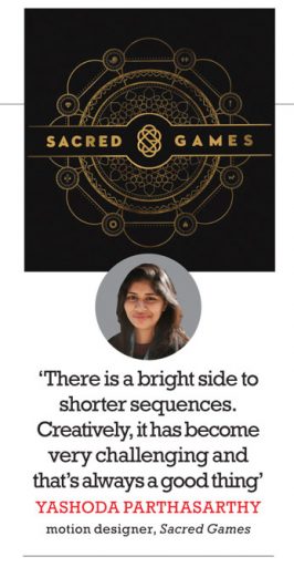
Title sequences are essentially “mood pieces”, says Vijesh Rajan, whose Mumbai-based production studio Plexus was behind the sequences for Inside Edge, Sacred Games and Mirzapur. It’s why he insists on having music beforehand because it instantly helps establish the mood of the sequence and thus the show. Yashoda Parthasarthy, Rajan’s creative partner and Plexus cofounder, elaborates on the process: “For Sacred Games, when we received the track from Alokananda Dasgupta [the composer], we kept listening to it on loop for a few days before we jammed on the edit of the sequence. We then arrived at the concept of keeping the title sequence about the chaotic state of mind that Gaitonde’s character was at the beginning of the show. The music motivated us to opt for a frenzy edit style intercutting with the mandala being revealed slowly. We also added a lot of sound design to the edit to better convey the distress and chaos, which was in Gaitonde’s mind and the thread that connects it all together—spirituality,” she says.

Now, with sequences becoming more visually inventive, they have become portals into the shows’ exciting new worlds. “The first time you see the sequence, it might just be a really aesthetic experience of a little visual poem to seduce you into this world. But that’s only for the first one or two episodes. It takes on greater value over time, as it makes you subconsciously reflect on the themes of the show,” says Clair, who uses Mad Men as an example. “If you describe Mad Men’s title sequence in one phrase, it would be ‘a man in free fall’. And that describes Don Draper from season one episode one right through to the end.”
Similarly, motion designer Jishnu Chatterjee had to illustrate the free fall of Harshad Mehta when he worked on the sequence for Scam 1992: The Harshad Mehta Story. And he took inspiration from a sequence designed by Clair and Marks. “True Detective season one was the first time I was really moved by a title sequence. The way it set the tone of the entire show was a work of art. I took many cues from it with regard to framing, composition, colour and pacing early on. I still use it as a reference every now and then when I’m trying to explain some visual ideas to my clients,” he says.
Bingeing, that unforeseen side-effect of streaming TV, has changed the way we perceive a title sequence. What used to be an introductory segment now feels like an intermission. “I’ve started to think of the title sequence as less of an opening sequence, more as a sequence you watch just after you’ve finished an episode before you begin the next one,” says Clair.“It’s like if you’ve got a show that often has a really intense final few minutes, then sometimes you want a moment to reflect on what they really meant. I think that’s the role title sequences play these days. If you’ve just found out who the killer is, you don’t want to jump straight back into the first scene of the next episode. You need a minute to process that even if you only end up doing it for half the title sequence, and then you ‘skip intro’. A strange, emergent quality of bingeing is that all of a sudden, the start of an episode is also really the end of the previous episode.”

Modern title sequences, Clair asserts, were also helped by the desktop revolution in animation and post-production. “It meant motion designers could craft images in the same way graphic designers could craft still images,” he says. With production quality continuing to improve, Chatterjee goes a step further, describing title sequences as “the most cutting-edge examples of motion design out there”. Parthasarthy believes the pipeline has become much more streamlined and the opportunities better than ever before. “It’s easier to collaborate with artists from all over the world and also keep developing and upgrading your skills, at the click of a mouse,” she says.
Despite the upswing, motion designers aren’t immune to pushback from producers. “Networks have been known to suggest keeping it short and only doing 5-10-second logo animations,” says Rajan. “But in our experience, most filmmakers like more elaborate sequences.” Parthasarthy contends, however, there is a bright side to shorter sequences. “Creatively, it has become very challenging but that’s always a good thing. And shorter duration equals shorter delivery timelines which equals more projects. So you get to do a lot more in a year,” she says. So, what is the optimal duration for a modern title sequence? Chatterjee says, “Thirty to 45 seconds is good enough to set the mood appropriately. Anything shorter than that feels too rushed.”
A recent trend among “the capital D dramas”, as Clair calls them, has been to do away with title sequences altogether for title cards. It’s something Clair and Marks experimented with in a genre show like Lovecraft Country. “It was based on a fantastic book. And there are a lot of references to pulp science-fiction books. So, we felt that was a great chance to do chapter cards effectively, instead of a title sequence. We had a different chapter card for each episode.”
It’s the genre shows that seem to be employing longer sequences because they act as a bridge between the real world and the fictional. “If you want to have that proper sort of airlock into the world, then you do want to have at least one time when you ask your audience to watch 60 or 90 seconds of a sequence,” Clair says. Borrowing Clair’s metaphor of an airlock, Marks describes the transportive scope of the title sequence, “A good title sequence isn’t totally within the show. It has one foot in our world and one foot in the dramatic world. If you’re coming back to a series you haven’t watched for a week or even a few days, it gives you about a minute to slowly, subconsciously bring you back into that [dramatic] world, you know, to grab you from this world and take you into that world. Like an airlock. So I think that’s where it’s particularly useful if you’re not bingeing.”

The meaning and significance of a title sequence has thus evolved. “Title sequences are basically becoming full-fledged microfilms set inside a larger series. Rather than introduce the series, they make a statement that can sometimes work by itself as well. I’m loving that shift of gears, where every title sequence is more ambitious than the last one, each with a distinct story to tell, purely visually,” says Chatterjee.
So, how, if at all, does the option of ‘skip intro’ in streaming services impact their artform? Not at all, they insist, even admitting they’re guilty of using the button themselves. “If I’m bingeing, it makes sense to skip,” Marks says. Parthasarthy attributes it to the audience’s shorter attention span, but Rajan is quick to reassure us: “Motion designers are now adapting to it by creating sequences that evolve with each episode.” Chatterjee shares a similar optimism: “It ultimately helps the artform grow.” Clair seconds the notion, “There’s a lot of space for innovation. Really, the most exciting thing about the streaming revolution is that cinema and TV have been in such rigid boxes for the last few generations. And those boxes have been smashed open. I think any new challenge is going to be very good for the prospects of combining motion design and storytelling.”
More Columns
Shubhanshu Shukla Return Date Set For July 14 Open
Rhythm Streets Aditya Mani Jha
Mumbai’s Glazed Memories Shaikh Ayaz