/wp-content/uploads/2025/07/Cover-Dhankhar-New.jpg)


/wp-content/uploads/2025/06/ColonialImprint1.jpg)
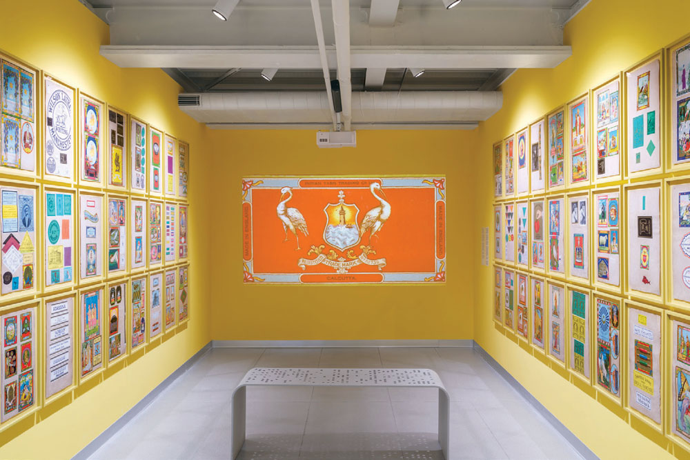
Textile labels, late 19th-early 20th century chromolithographs (Courtesy: MAP, Bengaluru)
THEY WALK IN single file, six men, barefoot and bent. Each one balances a bale of cloth the size of a coffin as they trudge across a narrow bridge. But the bridge is not made of stone or wood—it is composed of letters: SHAW WALLACE & CO. The bridge is commerce itself, carried by the colonised. If ever a diagram of capitalism deserved a shrine, it is this. The label, no bigger than a paperback, was printed in late-19th-century Manchester and glued onto bales of cotton bound for the South Asian market. It is one of nearly 300 chromolithograph textile labels featured in Ticket Tika Chaap, the Museum of Art & Photography’s (MAP) latest exhibition, drawn from a collection of over 7,000. Most were printed in Britain between the late 19th and early 20th centuries and shipped to India, where they were affixed to bales of mill cloth before being sent into bazaars, traded by middlemen, selected by housewives, and often inevitably forgotten.
Ticket. Tika. Chaap. Label. Stamp. Mark. The onomatopoeic name evokes the percussion of colonial commerce— the rhythmic tap of price stamps, the ink blot of approval, the silent violence of standardisation. The function of these labels was to seduce the eye in a market where text alone could not cross language or caste. So, we have gods and goddesses, lions and maps, peacocks, flags, flowers, flags, portraits of Indian women rendered in Victorian hues. There are warriors leaping from flames, ships sailing into a sunset, fruit spilling across cartouches, trains steaming past elephants. These labels are marvels of graphic compression—each one a miniature cosmology. They glow with saturated reds, electric blues, and unreal greens—made possible by chromolithography, the 19th-century printing technique that allowed for mass-production of high-resolution full-colour imagery.
The MAP show is arranged by motif—maps, monarchs, women, gods, machines. There is a case of commercial ephemera: invoices, merchant correspondence, design plates. In another corner, a concise account of the chromolithographic process. But importantly, this is a show about how to look. Or more precisely, about how to read a label without reducing it. And the labels speak.
These labels are marvels of graphic compression—each one a miniature cosmology. they glow with reds, electric blues, and unreal greens—made possible by chromolithography, the 19th-century printing technique that allowed for mass-production of high-resolution full-colour imagery
Some whisper. Others proclaim. One label shows a pink-hued map of undivided India with a golden lion stretched across it like a crown. The lion does not roar. It reclines—from Karachi to Calcutta—its body a metaphor for dominion. Another depicts Bharat Mata, haloed and flag-bearing, standing atop the map. The iconography is striking. The politics, messier. What is remarkable is that these nationalist symbols were printed not in India, but in Manchester, often for the very mills that Swadeshi protests sought to boycott. The image of Bharat Mata on a bale of factory-spun cloth isn’t an irony. It’s a strategy. If Swadeshi was about self-reliance, these labels offered the feeling of Swadeshi without the risk. They became the first visual filters of Indian nationalism—flattening, beautifying, exporting the aura of resistance while maintaining colonial profit. This is the perverse genius of the chromolithograph label: its ability to co-opt the symbols of opposition without ever acknowledging the cause.
“Archival documents in our collection, especially correspondence between merchants and printers, reveal that it was common for merchant agency representatives to send popular images from India to printers in England and Europe. Indian merchants were active participants in this trade, often sharing market insights with their British counterparts and possibly suggesting label designs. There was a deliberate and strategic effort to source, imitate, and adapt imagery to resonate with consumer preferences and drive sales,” says Shrey Maurya, director of research at MAP. “We live in a world that is far more connected than the one in which the labels circulated but what these visuals also show is how local culture and tastes were so intrinsic to marketing, a fact which holds true even today.”
Labels were inspired by Indian miniature paintings, 19th-century photography, religious prints, as well as Western illustrated literature, such as versions of the Rubaiyat of Omar Khayyam, which were sometimes adapted for Indian audiences. The visual economy of the Raj was one of enchantment. And enchantment, when done right, softens the edges of coercion. This is where the show takes its strongest stand—not in polemic, but in curation.
Ticket Tika Chaap does something rare: it reactivates a minor genre of art history— ephemeral commercial prints—and treats it with gravity. It positions the label not as trivia, but as ideology.
At their peak, these tickets were the TikToks of their time: quick, colourful, transregional, aspirational. They were engineered to please, yes, but they also contained the visual rhetoric of empire. These labels travelled. They were mass-produced, hand-glued, shipped, repurposed. They slipped between registers—art and advertisement, sacred and profane, British and Indian. What is remarkable is how fluid their grammar was.
This is what the exhibition flirts with, but does not fully confront, the tension between aestheticisation and erasure. The labels are glorious. But they are also complicit. Their beauty is a surface stretched over structural violence—over handloom collapse, over tariff regimes, over labour made invisible so that the image may gleam. The show gestures at this, but politely. One wonders what it might have been if these contradictions were made less comfortable.
Still, it is a show worthy of attention. Not because it answers everything, but because it lets the viewer see the questions in the image. These labels are not footnotes to history. They are fonts in which the empire spelled itself.
So yes, it is a beautiful show. But also a brutal one—if you are willing to look past the label.
(Ticket Tika Chaap runs at MAP, Bengaluru, till November 2)
About The Author


-

-
© 2024 Open Media Network Pvt. Ltd.
More Columns
Economist and House of Lords Peer Meghnad Desai Dies Lhendup G Bhutia
Tata Motors in talks to buy Italy’s Iveco in $4.5 bn deal Open
Books that expose a trusted healthcare brand Aditya Mani Jha