TATA.CARS: Why Reinvent the Name When Tata Had Already Reinvented the Car?
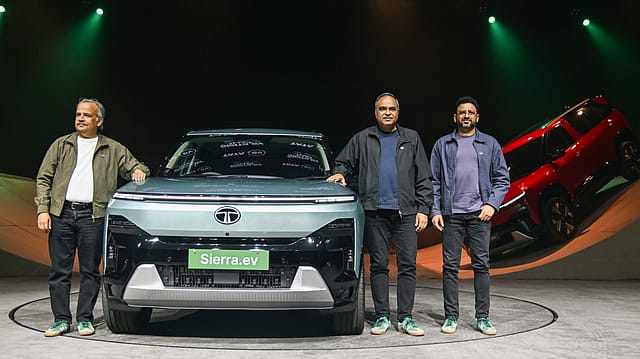
The full stop is carrying a surprisingly heavy load.
It must separate cars from trucks. Petrol from electricity. The engineering company India remembers from the passenger-car brand Tata wants a younger India to encounter. It must acknowledge a corporate demerger, tidy up a complicated garage and make a company founded in 1945 look entirely comfortable beside an app icon.
All this has been assigned to one small dot between TATA and CARS.
Tata Motors Passenger Vehicles has introduced TATA.CARS as its new consumer-facing identity. It arrives dressed in Ambition Blue, accompanied by a custom typeface, a sonic signature and the promise “Nothing’s Too Far”. Petrol, diesel and electric vehicles are to be presented within one experience. A famous industrial name has acquired the visual manners of a website.
Zeroing In on ECI
09 Oct 2026 - Vol 05 | Issue 41
Constitutional legitimacy versus political opportunism
At first glance, this appears to be the kind of exercise that keeps brand consultants, font designers and presentation decks in excellent health. Tata already means trust. Tata Motors already means automobiles. Its cars are recognisable, its dealerships are visible and several of its model names possess greater public currency than many corporate brands.
Why reinvent a name when nobody appears to have misplaced it?
That is precisely when a rebrand can be most strategic, says Ashita Aggarwal, professor of marketing at SP Jain Institute of Management & Research. A weak brand changes to escape old meaning; a strong one can change to organise new meaning. Tata is retaining the trust and recognition in its surname while giving the separated passenger-vehicle business a clearer consumer identity.
The answer begins with an important distinction. Tata Motors has not vanished. TATA.CARS is not the legal name of the entire automotive empire. It is the new public face of the passenger-vehicle business after a structural separation that made the old umbrella less useful.
The punctuation is following the paperwork.
The Garage Was Split Before the Signboard Changed
For decades, Tata Motors was an extraordinarily accommodating name. It could contain a Nano, a Nexon, an Indica, an Ace, a 407, a bus and a multi-axle truck without semantic complaint. “Motors” described a manufacturer rather than a category. It carried engineering weight and allowed almost anything fitted with wheels and ambition to enter.
That flexibility reflected the company itself. Passenger and commercial vehicles shared the Tata Motors identity even when their customers, economics, technologies and rhythms were strikingly different.
Then the corporate architecture changed.
Tata Motors announced in March 2024 that its commercial-vehicle business would be demerged into a separate listed entity. The separation became effective on October 1, 2025. Under the resulting structure, the commercial-vehicle company inherited the Tata Motors Limited name. The original company, which retained the passenger-vehicle businesses, Jaguar Land Rover and related investments, became Tata Motors Passenger Vehicles Limited.
That title may satisfy a registrar. It is less likely to inspire a family arriving at a showroom on Sunday.
TATA.CARS solves the consumer-facing problem created by the corporate solution. It gives the passenger business a category-specific home while preserving the most valuable word in the architecture. Tata remains. Motors moves to commercial vehicles. Cars receive their own front door.
The rebrand is, therefore, neither a repudiation of Tata Motors nor an attempt to manufacture trust from a new tube of Ambition Blue. It is an act of separation. Two independently listed businesses cannot indefinitely behave like departments inside the same public name without producing confusion.
The full stop acts like a traffic policeman at the demerger. Trucks proceed towards Tata Motors. Passenger vehicles turn towards TATA.CARS.
Motors Builds. Cars Invites
The change from “Motors” to “Cars” appears minor until the two words are asked to perform their respective jobs.
Motors belongs to the language of the industrial corporation. It evokes factories, engines, mechanical systems, manufacturing scale and the engineering history that allowed Tata to move from locomotives and commercial vehicles into passenger mobility.
Cars belongs to the customer. Few people tell their families that they are going to purchase a motor. They buy a car. The new name abandons corporate description for consumer vocabulary. It is narrower, friendlier and impossible to misunderstand.
Then comes the dot.
TATA.CARS resembles a domain even when it is printed on a wall. It suggests a digital destination rather than a conventional manufacturer. The identity can sit naturally on a phone, website, connected interface, dealership screen or social handle. The mark is simultaneously a name and something close to a navigation instruction.
Visit Tata. Find cars. That simplicity may be particularly valuable when the product beneath the name is becoming less simple. A contemporary passenger-vehicle company must sell combustion engines, batteries, charging, software, connectivity, finance, subscriptions, accessories and an expanding collection of digital experiences. The machine is becoming more complicated. The name becomes almost childishly direct.
There is also a generational intention. Tata says the identity is designed for the ambitions of a new India and presents its vehicles through ideas such as smarter, safer and greener mobility. “Motors” can sound like the company that makes the object. TATA.CARS wants to feel like the place through which the relationship is managed.
The danger, naturally, is that punctuation can suggest digital fluency but cannot create it. A dot may make a brand look like a platform. Only the experience can make it behave like one.
The Car Rebranded Tata Before Tata Rebranded the Name
The most interesting aspect of TATA.CARS is how late it arrives.
Tata’s passenger-vehicle reinvention did not begin in a branding studio in 2026. It began much earlier in design centres, product plans and on the metal itself.
By the middle of the previous decade, the passenger business was in trouble. Tata possessed vast automotive history but its cars were burdened by an ageing, utilitarian perception. The Indica had once democratised diesel personal mobility and the Nano had generated worldwide attention, yet neither could provide a contemporary design language for the next phase. Tata’s domestic passenger-vehicle market share had reportedly fallen from roughly 14 per cent earlier in the decade to around 5 per cent by FY2016.
In January 2016, Tata Motors introduced IMPACT Design, short for “Immediate IMPACT at first sight, Lasting IMPACT over time”. The terminology was consultant-friendly. The consequences were visible.
Tiago replaced the visual memory of older Tata hatchbacks with a more compact, cheerful and contemporary shape. Nexon brought a distinctive coupe-like compact SUV into one of India’s most competitive segments. IMPACT 2.0 followed. Altroz, Harrier, Punch and the revived Safari developed recognisable faces, stronger proportions and far greater road presence.
Tata was no longer asking consumers to admire Indian engineering despite the design. Design became part of the persuasion.
Safety supplied another pillar. Global NCAP results gave the company a powerful language at a time when Indian buyers were becoming more conscious of crash protection. SUVs provided category momentum. Tata also moved early and aggressively in electric passenger vehicles, using familiar models such as Nexon and Tigor to make EV adoption feel less like an experiment conducted in somebody else’s laboratory.
The result was a remarkable return to the top tier of India’s passenger-vehicle market. The company that had sunk to approximately 5 per cent rebuilt itself into a double-digit player and periodically challenged for the second position. Tata reported a 12.8 per cent Vahan market share in the second quarter of FY2026 and said it ranked second in September and October 2025.
The revival did not require Tata to escape its name. It required the cars to become more desirable.
That is why this rebrand differs from the standard corporate makeover applied after a reputational or commercial collapse. TATA.CARS is not cosmetic camouflage thrown over a broken product story. It is the identity catching up with a transformation consumers have already watched.
Tata spent a decade teaching India that a Tata car could look striking, own the road, lead with safety and run without petrol. The new name finally admits that the passenger business has acquired a personality distinct from the trucks parked elsewhere in the group.
One Tata, Several Addresses
The central branding challenge is now clarity.
Tata possesses an unusually powerful master brand. The same surname travels across salt, software, steel, hotels, jewellery, aviation, retail, finance and automobiles. That breadth lends every new initiative inherited trust, but it also creates a temptation to attach another descriptor whenever the business changes direction.
Inside the automotive garage, the architecture already includes Tata Motors for commercial vehicles, Tata Motors Passenger Vehicles as the legal passenger company, TATA.CARS as its consumer identity, Tata.ev for electric mobility, Avinya for a future premium electric proposition and Jaguar and Range Rover under JLR.
Each has a strategic explanation. Together, they can begin to resemble a residential complex in which every floor has commissioned its own nameplate.
For Aggarwal, the test of this architecture is subtraction rather than visibility: the new identity must reduce the number of relationships a customer has to decode. If TATA.CARS becomes the obvious home for every Tata passenger vehicle, it creates clarity. If it merely sits alongside Tata Motors, Tata.ev and Avinya as another name to remember, the rebrand has added vocabulary without reducing complexity.
TATA.CARS may simplify this if it becomes the unmistakable master destination for Tata-branded passenger vehicles across powertrains. An internal-combustion Curvv and an electric Curvv should feel like members of the same product family, not neighbours represented by competing identities. The announcement’s emphasis on unifying petrol, diesel and electric vehicles indicates that this is part of the intention.
That raises the future of Tata.ev as an interesting question. It has helped Tata claim leadership and specialist credibility in an emerging category. Yet as electric propulsion becomes a variant rather than an exotic species, maintaining a strong wall between “cars” and “EVs” may become less useful. Consumers do not visit separate brand universes for automatic and manual transmissions. Eventually, battery power may demand the same normality.
Avinya provides the opposite challenge. A premium electric range may need distance from Tata’s mass-market associations even while drawing reassurance from the parent. Jaguar and Range Rover already demonstrate how Tata can own globally distinct marques without insisting that its surname occupy the bonnet.
A rebrand has clarified the map only when people stop needing the legend.
Why the Global Automobile Industry Keeps Visiting the Logo Garage
Car companies are unusually fond of rebrands because the industry is enduring a collective identity crisis.
For more than a century, automobile manufacturers largely knew what they manufactured. Electrification, software, autonomy, connected services and new ownership models have disturbed that confidence. Companies that built engines now describe themselves as mobility or technology businesses. Logos designed for chrome grilles must function on charging apps, animated screens and illuminated surfaces.
The resulting makeovers may look similar. Flatter marks. Cleaner typefaces. Fewer colours. Grand declarations about a new era. But they do not all solve the same problem.
Kia offers the cleanest inversion of Tata’s move. In 2021, Kia Motors Corporation became Kia Corporation, introduced a dramatically connected new logo and declared its ambition to move beyond vehicle manufacturing into sustainable mobility. Kia removed “Motors” because the category felt too restrictive.
Tata has removed “Motors” from its passenger identity for the opposite reason. It wants to make the category explicit. Kia escaped the car. Tata has underlined it.
Volkswagen unveiled a flatter, two-dimensional identity in 2019 as the ID.3 introduced its electric era. The logo became easier to deploy digitally and the brand sought a lighter, more accessible personality. The change accompanied a genuine product and strategic shift, although it also arrived while Volkswagen was trying to travel beyond the shadow of Dieselgate.
General Motors presented a lower-case “gm” identity in 2021, its first major logo change in decades, as it promoted an all-electric future. The underline beneath the “m” hinted at its Ultium battery platform and the mark was designed to live comfortably in digital environments. The company did not ask buyers to abandon Chevrolet, Cadillac, Buick or GMC. It refreshed the corporate promise above them.
Jaguar chose rupture rather than reassurance. Its “Copy Nothing” reinvention introduced a new wordmark, symbols, colour palette and “Exuberant Modernism” ahead of an electric ultra-luxury future. Jaguar was not merely polishing a familiar cat. It was attempting to change what the marque represented, whom it addressed and how much distance it could create from its existing products. The controversy was therefore built into the size of the strategic leap.
Stellantis travelled in the other direction. The merger of Fiat Chrysler Automobiles and Groupe PSA required a new corporate roof above storied customer brands including Fiat, Jeep, Peugeot, Citroën, Alfa Romeo, Dodge and Maserati. Stellantis was explicitly reserved for the group level. The marques remained intact because no sensible person buys a Stellantis Wrangler.
These examples reveal four different species of automobile rebrand.
Some expand permission, as Kia attempted by moving beyond motors. Some signal technological transition, as GM and Volkswagen did around electrification and digitalisation. Some manufacture rupture, as Jaguar chose. Others organise ownership, as Stellantis does above multiple marques.
TATA.CARS combines two quieter tasks: organising a demerged business and translating an industrial identity into consumer language. It does not need to kill the past. Tata’s history is an asset. It does not need to invent trust. The parent name arrives carrying enough. It does not even need to announce that the products have changed. India has watched that happen model by model.
Its job is to tell customers where those changed products now live.
When the Wrapper Arrives After the Gift
This creates an unusual risk. Most struggling brands unveil a new identity and ask the future product to prove that the optimism was justified. Tata is doing the reverse. The product revolution has already supplied the evidence. The identity must now add meaning without looking ornamental.
Ambition Blue, custom typography and sonic branding can create consistency. “Nothing’s Too Far” can stretch from physical travel to personal aspiration. But none of these elements is the strategy by itself.
The strategic value lies in whether TATA.CARS becomes a useful organising idea for everything the passenger business does next: combustion and electric vehicles, physical and digital retail, mass and premium propositions, products and connected services.
The name also makes a refreshingly unfashionable bet. At a moment when every manufacturer wants to sound like a software platform, energy ecosystem or mobility-technology universe, Tata has chosen the bluntest available noun: Cars.
There is confidence in that simplicity. It says the category is not an embarrassment to be linguistically escaped. Electric or otherwise, connected or otherwise, the central object still matters. People may finance it through an app, update it through software and charge it from a wall, but they will park a car downstairs.
Perhaps that is what the full stop ultimately communicates.
Tata Motors was a sentence capacious enough to continue indefinitely: cars, trucks, buses, engines and whatever came next. The demerger ended that sentence. The passenger business required another. The company did not reinvent the name because the old one was broken. It reinvented the name because the business underneath it had separated, grown younger and developed a distinct destination.
Tata spent ten years redesigning the car. It has finally reached the nameplate.